
Your digital business card does more than share a phone number. Done well, it communicates your values, your aesthetic, and your professionalism before you've said a word. The professionals who stand out in 2026 are those who treat their digital card as a brand asset, not an afterthought.
To differentiate your brand with digital card design, focus on these core elements:
- Brand colour palette: Use your exact hex codes, not approximations. Colours render differently on screens than in print, so test on multiple devices and prioritise high contrast for legibility in varied lighting.
- Typography hierarchy: Your name and role should dominate visually. Supporting details sit smaller beneath. Strong typographic hierarchy alone can define a professional card without a single image.
- One clear action per card: Visual hierarchy works best when each card guides the eye to a single primary action, whether that is saving your contact or visiting your portfolio.
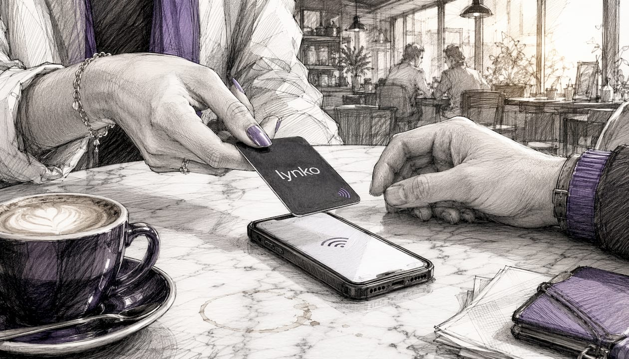
- Interactive elements: Tap-to-share via NFC, QR codes, and clickable social links turn a static card into a live brand touchpoint.
- Concise brand messaging: Your tagline or professional descriptor should reflect your brand voice, not generic filler like "passionate professional."
- Mobile compatibility: Every element must read clearly on a 6-inch screen in bright sunlight.
- Social proof: A Google review count, a client endorsement, or a visible credential adds immediate trust.
Why business cards still matter in a digital-first world
Physical networking has not gone away. Conferences, client lunches, trade shows, and chance encounters still happen, and the moment someone asks "how do I reach you?" is a branding moment. A fumbled phone exchange loses it. A polished digital card wins it.
The advantage of digital over paper is not just convenience. Digital cards update in real time, meaning a new phone number or job title propagates instantly without reprinting a thousand cards. They also carry analytics: you can see who tapped your card, when, and from where, which is information a paper card will never give you.
For UK professionals, the contactless business card also signals technological fluency. Handing someone an NFC card in 2026 communicates the same thing a well-designed website did in 2010: you are current, you pay attention, and you invest in your professional image. That perception forms in seconds.
Digital vs printed cards: which format serves your brand better?
Both formats have genuine strengths, and the honest answer is that they serve different moments rather than one replacing the other.
| Feature | Digital card | Printed card |
|---|---|---|
| Updateable in real time | Yes | No |
| Analytics and tap tracking | Yes | No |
| Multi-link and rich media | Yes | No |
| Tactile impression | No | Yes |
| Works without a smartphone | Limited | Yes |
| Environmental impact | Low | Higher |
| Cost over time | Low | Recurring print costs |
| Perceived formality in traditional sectors | Moderate | High |
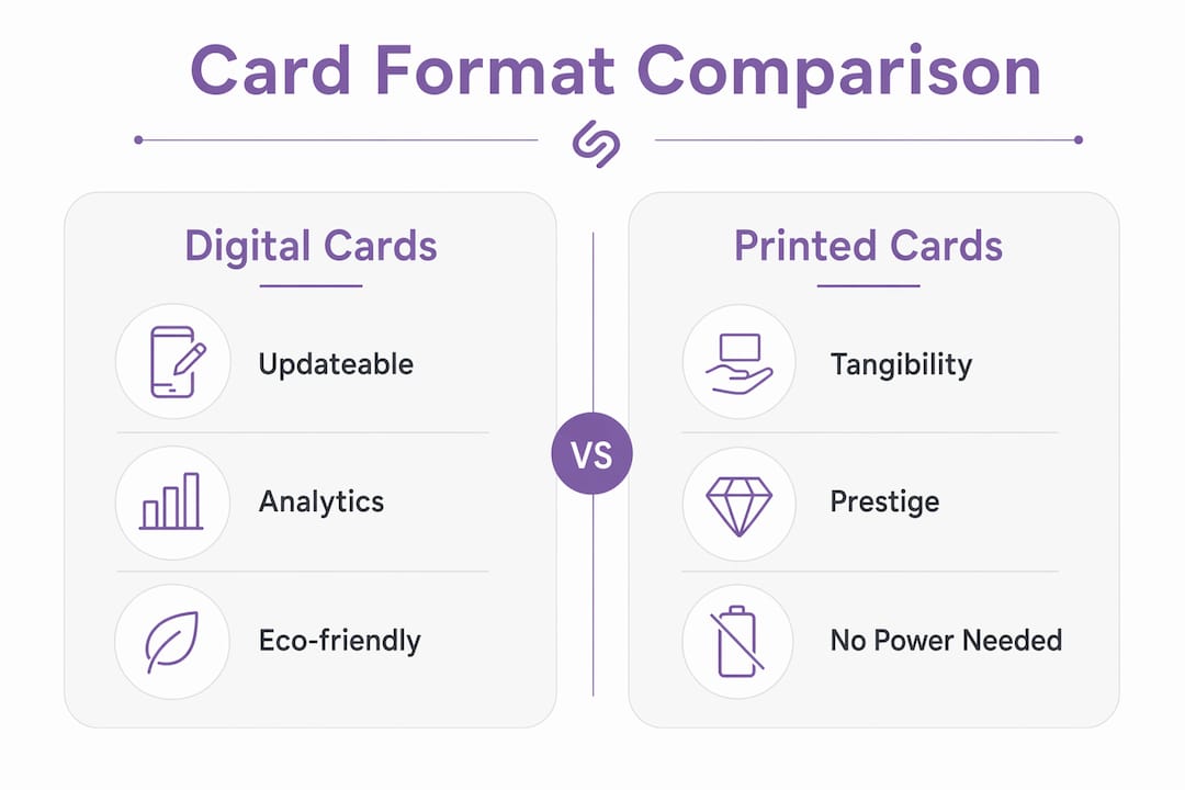
Printed cards still carry weight in sectors where physical artefacts signal prestige: law, finance, luxury retail. A beautifully embossed card handed across a boardroom table carries a tactile authority that a tap cannot fully replicate. For those contexts, a hybrid approach works well: a premium printed card that carries a QR code linking to a full digital profile.
For most UK professionals and small business owners, though, digital cards win on almost every practical measure. They are cheaper over time, richer in functionality, and far easier to keep current. The question is not whether to go digital, but how to make your digital card genuinely distinctive.
How to design a digital business card that people actually remember
Good digital card design is not about decoration. It is about communicating the right things in the right order, fast.
1. Start with your brand promise, not your colour palette
Before opening any design tool, write one sentence that describes what you do and why clients choose you over anyone else. That sentence should drive every design decision. A brand's promise must guide digital card design, validated through testing concepts with real clients rather than internal guesswork.
2. Build three distinct design concepts
Create one concept that leads with your logo, one that heroes your brand colour, and one that uses a lifestyle or portfolio image. Test these with a small group of trusted clients or colleagues. They will tell you quickly which feels most authentic to your brand.

3. Rank your information by reference frequency
Treating all information equally creates clutter. Ask yourself: what does someone need to find in the first two seconds? Your name and your primary contact method. Everything else is secondary. Size and position elements accordingly.
4. Use standard icons, not invented ones
Familiar icons speed up professional networking without requiring explanation. A LinkedIn logo, a phone icon, an envelope: these communicate instantly. Custom icons that require interpretation slow people down and create friction at exactly the wrong moment.
5. Add visual signifiers of interactivity
Shadows, borders, and contrast signal to the viewer that an element is tappable. Without these cues, people do not know what to press. This is a small detail that separates a card that gets used from one that gets ignored.
6. Optimise for mobile contrast
Test your card on an iPhone and an Android device, in a bright room and a dim one. If your text disappears against your background in sunlight, your colour choices need revisiting regardless of how good they look on a desktop monitor.
7. Keep it uncluttered
Well-designed digital product representations influence over 60% of customers to purchase, with visual quality outweighing textual descriptions. Less information, presented clearly, outperforms a comprehensive data dump every time.
8. Gather feedback before you publish
Show your card to three people outside your industry. If they cannot tell what you do within five seconds, the design needs work. This is the fastest and cheapest usability test available.
Pro Tip: Create a simple one-page brand guide for your digital card: your hex codes, your approved logo version, and your font choices. This keeps every future update consistent, even if someone else makes the change.
Choosing the right format for your brand in the UK market
Format choice is not purely aesthetic. It depends on your audience, your sector, and how you actually network.
- Assess digital comfort in your sector. A tech founder's audience expects NFC. A solicitor's clients may not. Match the format to what your audience will find natural, not what you find exciting.
- Consider update frequency. If your role, phone number, or services change regularly, a digital card with real-time profile editing is far more practical than reprinting.
- Evaluate your brand personality. A modern, forward-facing brand gains credibility from a digital card. A heritage brand with a traditional client base may find a premium printed card more congruent with its positioning.
- Match format to networking setting. Formal presentations and boardroom meetings suit a physical card. Trade shows, creative events, and casual meetups are where NFC cards shine: fast, frictionless, and memorable.
- Think about analytics. If you want to know whether your networking is generating interest, only a digital card gives you that data. Tap counts, profile views, and link clicks tell you which events and which contacts are worth following up.
- Factor in environmental positioning. For brands that emphasise sustainability, a digital-only card is a consistent signal. Handing out paper cards while talking about your green credentials is a contradiction clients notice.
For creative professionals in the UK, NFC cards have become a genuine differentiator in 2026, particularly at portfolio events and agency pitches where standing out from a pile of identical paper cards matters enormously.
Aligning your card design with your brand promise
Design alignment is not about matching colours to your website. It is about ensuring that every element of your card communicates the same thing your brand says everywhere else.
The practical test is simple: put your digital card next to your website homepage and your most recent social media post. Do they feel like they come from the same organisation? If there is a visible gap in colour, tone, or quality, that gap is what clients perceive as inconsistency, and inconsistency erodes trust.
Lynko's approach to NFC digital cards addresses this directly. Themes and modules are tailored to individual brands, so the card does not look like a generic template with a name dropped in. The profile updates in real time, meaning the card always reflects the current version of your brand, not the version you had six months ago when you first set it up.
Prioritising information by reference frequency is one of the most underused principles in card design. Your name and primary contact method belong at the top. Your social links and portfolio URL sit below. Your company registration number, if it appears at all, goes at the very bottom. This is not a stylistic preference; it reflects how people actually use a card in a networking context.
How colour and typography shape brand perception
Colour is not decoration. It is communication. Blue signals reliability and calm, which is why financial services defaults to it. Orange signals energy and approachability. Purple, as Lynko uses, sits at the intersection of creativity and professionalism: it reads as premium without the coldness of black or the conservatism of navy.
Typography carries similar weight. A serif font on a digital card signals heritage and authority. A clean geometric sans-serif reads as modern and direct. The mistake most professionals make is choosing a font they like rather than one that matches what their brand actually promises. A copywriter whose card uses a playful display font is telling clients something different from one who uses a tight, editorial sans-serif, even if the words are identical.
The UK Government Design System makes a point that applies directly here: images add value only when they contribute meaningful information. The same logic applies to decorative typography. If a stylised font makes your name harder to read, it is working against you, not for you. Legibility is always the first requirement.
Contrast is the technical side of this. The Web Content Accessibility Guidelines (WCAG) set minimum contrast ratios for text legibility, and digital cards that fail this standard are not just inaccessible: they look unprofessional on any screen that is not perfectly calibrated. Understanding common UI design mistakes around contrast and colour is a practical starting point before you finalise any palette.
What standout digital card design looks like in the UK market
The UK market in 2026 shows a clear split between two dominant approaches. Creative professionals, consultants, and agency owners tend towards minimal, high-contrast cards with a strong typographic identity and one or two carefully chosen brand colours. Professional services firms, particularly those targeting corporate clients, lean towards structured layouts with clear credential signalling: qualifications, firm name, and a single clean headshot.
What both approaches share is restraint. The cards that get saved, shared, and remembered are not the ones with the most information. They are the ones where the design makes an immediate, confident statement and then gets out of the way.
For design branded digital profile cards, the most effective UK examples tend to use a dark background with a single accent colour, a professional photo or logo mark, and no more than four contact links. The NFC tap mechanic itself becomes part of the brand story: it signals that the person handing you the card is someone who thinks carefully about how they present themselves.
Tools for creating a distinctive digital card
Several tools serve different needs and budgets in the UK market. Canva offers accessible templates for professionals who want to design their own card visuals without a designer. Adobe Express provides more typographic control for those comfortable with creative software. For the actual digital card infrastructure, the platform matters as much as the visual design.
Lynko sits at the more considered end of the market: NFC-enabled cards with customisable digital profiles, real-time analytics, unlimited social links, and GDPR-compliant data handling. The setup is straightforward, and the card works by tapping to any smartphone without requiring the recipient to download an app. For professionals who want their card to function as a genuine brand asset rather than a digital version of a paper card, that combination of physical NFC card and live digital profile is the most complete solution currently available in the UK.
Understanding card UI design patterns is also worth the time if you are building or customising your own card layout, particularly around spacing, hierarchy, and interactive signifiers.
How to measure whether your digital card is working
A digital card that cannot be measured is a missed opportunity. The metrics worth tracking fall into three categories.
Engagement metrics tell you whether people are interacting with your card after the tap: profile views, link clicks, and contact saves. A high tap count with low link clicks suggests your card is being seen but not compelling action. That is a design problem, not a distribution problem.
Conversion metrics connect card activity to business outcomes. If you tap twenty cards at an event and receive three enquiries in the following week, your card is converting at 15%. Track this across different events and contexts to understand where your networking generates real return.
Consistency metrics are less obvious but equally useful. Check whether your card's visual identity still matches your website, your LinkedIn profile, and your email signature. Brand drift happens gradually, and a quarterly review of all your touchpoints keeps everything aligned.
Lynko's smart business card analytics dashboard gives you tap data, profile view counts, and link click breakdowns without any manual tracking. For a small business owner who networks regularly, that data is the difference between guessing which events are worth attending and knowing.
Key takeaways
A digital business card that genuinely differentiates your brand combines clear visual hierarchy, brand-aligned colour and typography, and interactive NFC functionality that gives you measurable networking data.
| Point | Details |
|---|---|
| Visual hierarchy drives recognition | Rank information by reference frequency: name and contact first, everything else below. |
| Colour and typography communicate brand values | Choose fonts and colours that match your brand promise, not just your personal preference. |
| Interactive elements convert interest into action | NFC tap-to-share and clickable links turn a card view into a measurable engagement. |
| Design alignment builds trust | Your card, website, and social profiles must feel like they come from the same brand. |
| Analytics turn networking into a measurable activity | Track tap counts, link clicks, and contact saves to identify which contexts generate real return. |