
A digital card is a shareable, interactive profile that replaces the paper business card with a live, clickable experience. Digital card design best practices centre on three things: clear visual hierarchy, accessible layouts, and content focused enough to prompt an immediate action. Get those three right, and your card becomes a networking tool. Get them wrong, and it becomes noise.
1. What key elements should every effective digital card contain?
The most effective digital cards carry only what the recipient needs to act. Every element earns its place or it goes.
The non-negotiables are: your name, job title, professional photo, and company name at the top. Below that, place contact details as live links. A phone number should dial on tap. An email address should open a mail client. A website URL should load in a browser. These are not decorative; they are the card's entire purpose.
- Name and title: Use your full professional name and your exact job title. Abbreviations confuse people who do not know you yet.
- Photo: A clear, well-lit headshot builds trust before a word is read.
- Contact links: Phone, email, and website must be tappable, not just displayed as text.
- Social icons: Link only the platforms where you are genuinely active. Dead links damage credibility.
- Bio or tagline: One sentence. Think of it as your elevator pitch in writing.
- Call-to-action button: One primary action, placed prominently. "Save contact," "Book a call," or "View portfolio" are all strong options.
The ideal digital card layout places critical contact information above the fold on a 375px-wide mobile view. That means name, title, photo, phone, email, and website must all be visible without scrolling. If a recipient has to scroll to find your number, most will not bother.
Pro Tip: Limit yourself to one primary call-to-action button per card. Multiple competing buttons split attention and reduce the chance that any single action gets taken.

2. How to achieve clarity and accessibility in digital card layouts
Accessible design is not a bonus feature. It is the baseline for any card that aims to reach every recipient, regardless of device or ability.
The WCAG 2.1 AA standard sets colour contrast ratios at 4.5:1 for normal text and 3:1 for large text. These ratios are not arbitrary. They reflect the minimum contrast at which most people with low vision can read text comfortably. Run your card's colour palette through a contrast checker before publishing.
- Touch targets: Every tappable element must be at least 44x44px. Smaller targets cause mis-taps on mobile, which frustrates recipients and breaks the impression you are trying to make.
- Responsive layout: Design for a 375px-wide vertical viewport first. Most recipients will view your card on a phone in portrait orientation.
- Scalable typography: Never use fixed font sizes in pixels if they prevent the browser from zooming. Use relative units such as
remoremso text scales with the user's device settings. - Focus states: Every interactive element needs a visible focus indicator for keyboard and assistive technology users. A 2px solid outline in a high-contrast colour is the minimum.
- Fluid spacing: Use proportional padding and margins rather than fixed values. This keeps the layout coherent across screen sizes without manual adjustment.
Pro Tip: Test your card on an actual mobile device, not just a browser emulator. Emulators do not replicate real touch behaviour or font rendering accurately.
3. Which visual design principles improve digital card impact?
Strong visual hierarchy is the single biggest driver of card scannability. Recipients spend seconds, not minutes, on a card. Your design must guide their eye to the most important information first.
Font size and weight do most of the work. Your name should be the largest text element. Your title should be slightly smaller. Contact details and social links sit below that in a consistent, smaller size. Colour can reinforce this hierarchy, but it should not replace it. A card that relies entirely on colour to communicate priority fails for colour-blind recipients.
- Elevation effects: A subtle box shadow (for example,
0 2px 8px rgba(0,0,0,0.08)) lifts the card visually from the background without adding visual noise. Heavy shadows look dated and distract from content. - Image containment: Applying a subtle outline of
1px solid rgba(0,0,0,0.1)withoutline-offset: -1pxprevents profile photos from bleeding into card backgrounds. This is a small detail that separates polished cards from amateur ones. - Consistent spacing: Use a spacing scale (for example, multiples of 4px or 8px) for all padding and margins. Inconsistent spacing is one of the most common signs of an unfinished design.
- Interaction states: Every button and link needs hover, active, and focus states. These states tell the recipient that an element is interactive before they tap it.
- Content restraint: Cards that try to say everything say nothing. Limit each card to one primary message and one primary action.
Cards work best when they group comparable, scannable information. Cards add visual clutter when applied to dense or unique content where a list or table would serve better. Knowing when not to use a card is as important as knowing how to design one.
4. How to build scalable card components in Figma
Scalable card design starts with a single, well-structured base component. Building one component and extending it through variants is far more maintainable than creating separate frames for every card state.
Creating a single base card component in Figma using vertical auto-layout and boolean properties for media and actions is the standard approach for 2026 design systems. Boolean properties let you toggle the photo, the action button, and the footer on or off without duplicating the component. That means one source of truth for your entire card library.
| Component property | Purpose | Example value |
|---|---|---|
| Vertical auto-layout | Maintains consistent spacing as content grows | Gap: 16px, padding: 24px |
| Boolean: media | Toggles profile photo on or off | True / False |
| Boolean: actions | Toggles CTA button visibility | True / False |
| Elevation variant | Sets shadow depth for card state | Flat, raised, outlined, selected |
| Spacing tokens | Applies design system values uniformly | 4px, 8px, 16px, 24px |
Document every clickable region and interaction state in your handoff notes. Developers should not have to guess which elements are interactive or what happens on hover. Clear documentation reduces back-and-forth and speeds up production.
For variable content cards, use CSS flexbox with flex: 1 on the content area and margin-top: auto on the action section to keep buttons anchored at the bottom regardless of how much text appears above. This technique eliminates the misaligned button problem that plagues cards with varying bio lengths.
5. Common mistakes that undermine digital card design
The most damaging mistakes in card design are not dramatic. They are quiet, structural errors that accumulate into a poor experience.
- Fixed heights: Using fixed heights on cards causes clipped text or awkward white space when content varies. Use
min-heightinstead. The card expands to fit its content and never cuts off a job title or bio mid-sentence. - Multiple primary actions: Two "primary" buttons mean neither is primary. Pick one action and make it count.
- Excessive decoration: Heavy borders, multiple shadows, and gradient backgrounds compete with your content. Decoration should support the hierarchy, not fight it.
- Missing focus states: A card with no visible focus indicator fails keyboard users and fails WCAG 2.1 AA compliance. This is a legal risk in many jurisdictions, not just a design preference.
- Wrong element choice: Cards are most effective for sets of comparable items. If you are displaying a single block of dense information, a card adds unnecessary structure. Use a list or a table instead.
- No real-data testing: Designing with placeholder text hides problems. Test your card with your actual name, title, and bio. Long names and long titles break fixed-width layouts in ways that "Lorem Ipsum" never reveals.
Pro Tip: Preview your card on three different devices before publishing: a small Android phone, a mid-size iPhone, and a tablet. If it reads clearly on all three, it is ready.
Effective digital card design also means knowing when to update. A card that reflects an old job title or a defunct social profile does more harm than no card at all. Build updating into your workflow, not as an afterthought.
Key takeaways
Effective digital card design requires accessible layouts, focused content, and a single clear action to drive meaningful networking results.
| Point | Details |
|---|---|
| Prioritise above-the-fold content | Place name, title, photo, and contact links within the first screen on a 375px mobile view. |
| Meet WCAG 2.1 AA contrast standards | Use a 4.5:1 contrast ratio for normal text and 3:1 for large text on all card elements. |
| Use dynamic sizing, not fixed heights | Apply min-height so cards adapt to content length without clipping or awkward gaps. |
| Build one base component in Figma | Use vertical auto-layout and boolean properties to manage variants without duplicating frames. |
| Limit actions to one per card | A single, prominent call-to-action button produces clearer results than multiple competing options. |
What I have learned from designing digital cards that actually work
The biggest mistake I see designers make is treating a digital card like a miniature website. They pack in every social link, a full biography, a portfolio preview, and three call-to-action buttons. The result looks thorough. It performs terribly.
The cards that generate real connections are the ones that make one thing obvious: how to reach you, right now. Everything else is secondary. I have reviewed cards from senior professionals at well-known firms that buried the phone number below a decorative banner and two paragraphs of brand copy. Nobody called.
Mobile-first is not a trend. It is the reality of how cards get shared and viewed. When I design for a 375px viewport first and scale up, the desktop version almost always looks better too. The constraint forces clarity. Designing for desktop first and then "making it work" on mobile produces compromises that show.
The detail I keep returning to is real-data testing. Placeholder text is a lie. Your actual name, your actual title, your actual bio: these are the inputs that reveal whether a layout holds. I have seen beautifully designed cards collapse the moment a real person with a long double-barrelled surname and a verbose job title fills them in. Test with real content from day one.
Analytics matter more than most designers admit. If your card platform shows you that recipients tap your email link but never your website link, that is a signal. Adjust the hierarchy. Move the website link. Test again. Design without feedback is guesswork dressed up as craft.
— Olivier
Lynko makes card design best practices easy to apply
Putting these principles into practice is straightforward when your platform is built around them. Lynko's NFC business cards are designed with mobile-first layouts, customisable themes, and modules that let you control exactly what appears on your profile and in what order.
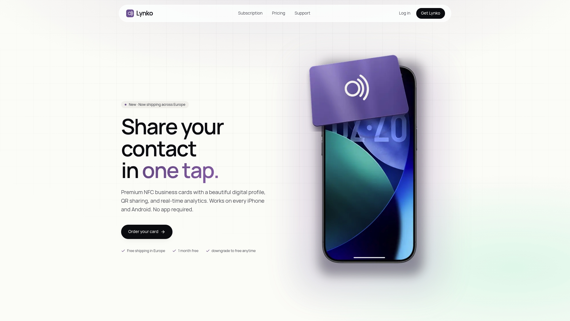
Lynko cards support unlimited social links, Google reviews, and a contact-saving feature that works without an app. Every profile is GDPR-compliant and includes real-time analytics so you can see which elements recipients engage with. If you want a digital business card that reflects the design standards covered here, without building it from scratch, Lynko is worth a look.
FAQ
What should go above the fold on a digital business card?
Your name, job title, professional photo, phone number, email address, and website link should all appear within the first screen on a 375px-wide mobile view. Recipients should not need to scroll to find your contact details.
What contrast ratio do digital cards need to meet?
WCAG 2.1 AA requires a 4.5:1 contrast ratio for normal text and 3:1 for large text. These ratios apply to all text on your card, including contact details and button labels.
What is the minimum touch target size for interactive elements on a digital card?
Every tappable element, including buttons, phone links, and social icons, must be at least 44x44px. Smaller targets cause mis-taps on mobile and reduce usability.
Why should I avoid fixed heights on digital cards?
Fixed heights clip text or create awkward white space when content varies in length. Using min-height instead lets the card expand naturally to fit its content, which produces a cleaner result across all devices.
When should I use a card versus a list or table?
Cards work best for sets of comparable, scannable items. For dense or unique information, a list or table communicates more clearly and adds less visual weight than a card layout.